
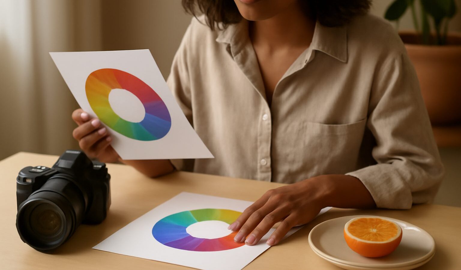
Colour theory photography sounds academic, but it is really just a set of habits that help you notice which colours are in your frame and how they work together. Singapore is one of the most colourful places you could learn in, from the painted shophouses of Joo Chiat to the neon of Chinatown, the greens of the Botanic Gardens and the wild sunsets over the western sky. Once you understand a few basic relationships, you stop taking random colourful photos and start making deliberate ones. This guide keeps the theory light and the practice local.
The Colour Wheel in Plain Terms
The colour wheel is just the rainbow bent into a circle. Reds, oranges and yellows sit on one side, and blues, greens and violets on the other. Where two colours sit relative to each other tells you how they will behave in a photo.
- Primary colours are red, blue and yellow, the building blocks.
- Secondary colours are green, orange and violet, made by mixing two primaries.
- Complementary colours sit directly opposite each other, like blue and orange, or red and green. Placed together they make each other look more intense.
- Analogous colours sit next to each other, like yellow, orange and red, and they feel calm and harmonious because they share a family.
You do not need to memorise a wheel. Just remember two moves: opposite colours create contrast and energy, neighbouring colours create harmony and calm.
Warm Versus Cool, and Why It Sets the Mood
Every colour leans warm or cool, and that lean carries emotion. Warm colours, the reds, oranges and yellows, feel lively, close and inviting. Cool colours, the blues, greens and violets, feel calm, distant and quiet.
You feel this every day here. The golden light just after sunrise over Marina Bay is warm and hopeful. The blue hour just after sunset, when the sky glows deep blue and the city lights switch on, is cool and cinematic. A hawker centre at night mixes warm tungsten glows with cool fluorescent tubes, and learning to spot that mix helps you decide what to keep and what to correct.
This is where white balance comes in. White balance is the camera setting that decides whether whites look neutral, warm or cool. On auto, your camera guesses, and under mixed hawker lighting it often guesses wrong. Set it to the matching preset (daylight, shade, tungsten) or nudge it warmer or cooler yourself to control the mood on purpose rather than leaving it to chance.
Colour Combinations That Reliably Work
You can lean on a handful of dependable schemes rather than guessing. The table below matches each scheme to a feel and a place you can practise it.
| Scheme | How it looks | Feeling | Try it in Singapore |
|---|---|---|---|
| Complementary | Two opposite colours, one dominant | Bold, high energy | Blue dusk sky against orange street lamps |
| Analogous | Neighbouring colours together | Calm, harmonious | Sunset reds, oranges and yellows over the sea |
| Monochromatic | One colour, many shades | Elegant, unified | Green on green in the Botanic Gardens |
| Accent | Mostly neutral with one bright pop | Focused, graphic | A single red lantern in a grey lane |
| Triadic | Three evenly spaced colours | Playful, balanced | A Peranakan tile wall in Katong |
Start with the accent scheme, because it is the easiest to see. Look for a mostly plain scene, then wait for one strong colour to enter it, a red umbrella, a yellow taxi, a blue door. That single pop against calm surroundings is colour theory doing its job.
Seeing and Using Colour on Location
Training your eye is more useful than any rule. A few habits help.
- Name the colours out loud. Before shooting, quickly note the two or three main colours in the scene. If they clash badly, move so one leaves the frame.
- Look for opposites. When you spot blue near orange, or red near green, get closer. Complementary pairs are everywhere in our streets, from festival decorations to sports jerseys.
- Simplify. Too many strong colours fight each other. Often the fix is to isolate one subject against a plainer background, which ties neatly into using negative space to let a colour stand alone.
- Use the light’s colour. Shoot warm subjects in warm light and cool subjects in cool light for harmony, or deliberately mix them for tension.
- Mind reflections. Wet roads and glass towers bounce colour around after rain, so it is worth pairing this with photographing reflections for double the colour.
On a phone, tap to focus, then look at whether the whole image feels too orange or too blue and adjust the warmth slider in your camera or editing app. Small corrections keep skin tones natural under our mixed lighting.
Colour in Editing, Honestly
Editing is where colour theory pays off, but keep it truthful. You can gently boost a complementary contrast, warm a sunset or cool a rainy street to strengthen the mood. What you should not do is push colours so far that the scene becomes a lie, especially for news, documentary or anything you are selling. A grounded approach is to correct white balance first, then nudge saturation and warmth only enough to match what you actually felt at the scene.
Two small cautions for our climate. First, the harsh midday sun oversaturates reds and greens, so you may need to pull saturation back rather than up. Second, haze flattens colour, so on hazy days lean into softer, analogous schemes instead of fighting for punchy contrast that is not there.
Simple Exercises to Build Colour Sense
- One colour a day. Choose a colour each morning and photograph only subjects featuring it. You will start seeing that colour everywhere.
- Complementary hunt. Spend an outing finding blue and orange pairs, then red and green pairs.
- Neutral plus pop. Shoot mostly grey or beige scenes and wait for a single bright accent to appear.
- White balance test. Photograph the same hawker stall on auto, then on tungsten, and compare the mood.
Final Thoughts
Colour theory photography is not about rules to obey but about choices to make with your eyes open. Learn the wheel loosely, feel the difference between warm and cool, lean on a few reliable schemes, and edit with honesty. Practise in our vivid streets, from Katong tiles to blue-hour skylines, and your colours will start to feel intentional. Explore more: pair these ideas with travel photography tips and a study of leading lines to guide the eye through all that colour.