
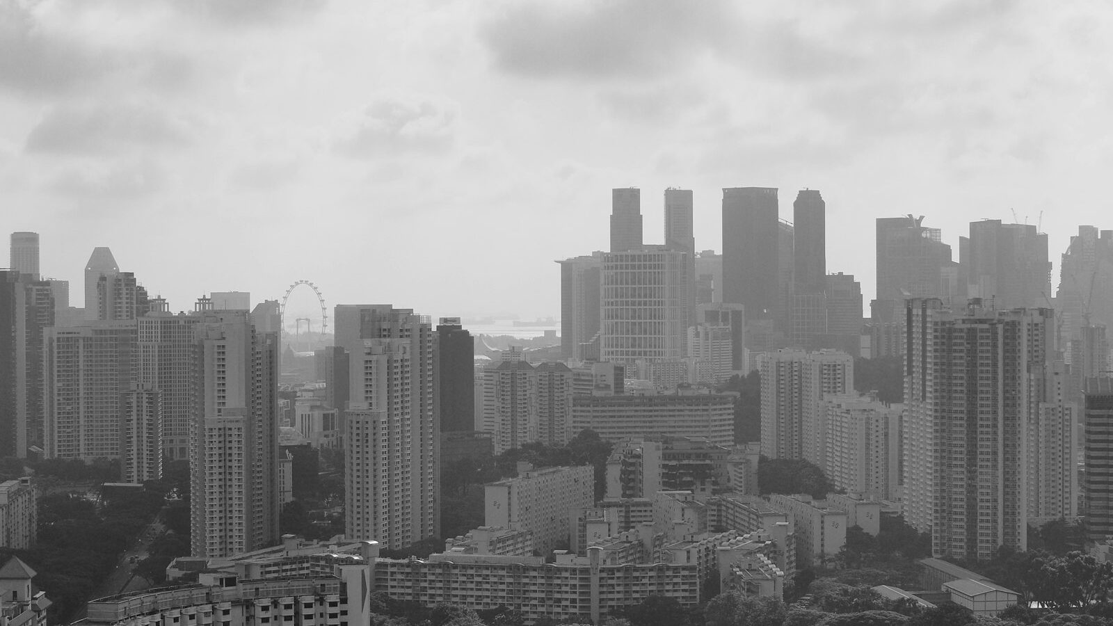
Strip the colour out of a photo and something interesting happens. The eye stops chasing bright reds and blues and starts reading light, shadow, shape and texture instead. Black and white photography is not a filter you slap on at the end. It is a way of seeing, and once it clicks, the humid, high-contrast light of Singapore becomes a gift rather than a problem. This guide covers how to see in monochrome, the settings that help, and how to finish a mono frame that actually holds attention.
Why Black and White Still Matters Here
Colour can carry a photo, but it can also crowd it. A busy hawker centre, a cluttered heartland corridor or a tangle of shophouse signage often looks calmer and more deliberate in black and white, because the distraction of mismatched colours disappears. What remains is structure. The curve of a five-foot-way arch, the geometry of an HDB stairwell, the texture of weathered kaya toast marble.
Our light suits mono well. The harsh tropical midday sun that ruins colour portraits, all shine and hard shadow, becomes an asset in monochrome, where deep shadows and bright highlights create drama rather than a headache. A grey monsoon sky that looks flat and dull in colour can read as moody and cinematic once the colour is gone. Learning to spot these situations is half the skill.
Learn to See in Tones, Not Colours
The single biggest shift is to stop thinking in colours and start thinking in tones, meaning how light or dark each part of the scene will become in grey. Two very different colours, say a red shirt and a green wall, can turn into almost the same murky grey and merge into a mess. So before you shoot, ask where the light and dark areas are and whether they separate cleanly.
Look for these ingredients:
- Contrast. Bright against dark gives mono its punch. A figure lit by a shaft of light in a dim void deck. A pale wall behind a dark silhouette.
- Texture. Peeling paint, wet pavement, tree bark, an old man’s weathered hands. Side light rakes across texture and makes it sing.
- Shape and line. Strong shapes and leading lines do more work in mono, where they are not competing with colour.
- A clear subject. Without colour to guide the eye, composition must do the pointing.
A practical trick is to set your camera or phone to a black and white preview so you see the scene in mono as you shoot. This trains your eye fast, even if you keep the colour file underneath.
Camera and Phone Settings for Mono
You do not need special gear, only a few habits.
- Shoot RAW plus a mono preview if you can. On a camera, choose a monochrome picture style so the screen shows black and white, while the RAW file quietly keeps full colour data for flexible editing later. You get the best of both.
- Watch your contrast in the scene, not just the settings. Expose so you keep detail in the brightest whites, because pure blown white cannot be recovered.
- Use the histogram. This graph of brightness tells you if you are clipping the shadows or highlights. Aim to keep some tone at both ends unless you want a deliberately stark look.
- Keep ISO sensible. ISO is the sensor’s sensitivity to light. Higher ISO adds grain, which some love in mono for a classic film feel and others prefer to avoid. That is a taste choice, not a rule.
- On a phone, use the built-in mono filter for the preview or a Pro mode, but shoot RAW where offered so you can convert thoughtfully rather than being stuck with the phone’s baked-in version.
Colour to Mono: What Changes and Why
This table shows how thinking shifts when you drop colour.
| Element | In colour photography | In black and white photography |
|---|---|---|
| What draws the eye | Bright, saturated colours | Contrast between light and dark |
| Harsh midday sun | Often a problem, flat or garish | An asset, strong shadows and drama |
| Cluttered background | Distracting mix of hues | Calmer, reads as tone and shape |
| Texture | Secondary to colour | A leading feature |
| Editing lever | Saturation and white balance | Contrast, blacks, whites and clarity |
Read the right column before you press the shutter and you will frame stronger mono shots from the start.
Editing Colour Files Into Convincing Black and White
The conversion is where a flat grey photo becomes a striking one, so do not just tick a desaturate box. Work the tones deliberately.
Start by setting a true black and a true white so the image has a full range from deep shadow to bright highlight. Then add contrast and clarity to give the frame its bite. The most powerful tool is the black and white mix, which lets you brighten or darken specific original colours in the grey conversion. Darkening the blue channel, for example, deepens a Singapore sky and makes clouds stand out dramatically, which is a classic move for skyline and street work.
Be honest about how far you push things. Editing tone and contrast is normal and expected. Removing or adding real elements moves you into a different, more manipulated territory, which matters if the image is documentary or news. For everyday creative work, enjoy the freedom.
Where to Practise Around Singapore
Good mono is everywhere once you look. Chinatown and Kampong Glam shophouses offer texture, arches and strong side light in the late afternoon. Hawker centres reward patient candid work, though you should always respect people’s privacy, ask before shooting identifiable strangers up close, and delete images on request. The brutalist geometry of older HDB blocks and multistorey car parks is a monochrome playground of line and shadow. On a wet day, reflections in puddles and rain-slicked pavements turn dreary weather into atmosphere.
Black and white also pairs naturally with related techniques. A backlit figure often works best as a mono silhouette, and a moody skyline can look timeless stripped of colour. Try shooting the same scene in both, then compare. The comparison itself teaches you more about seeing than any single tip.
Explore more: how to shoot silhouettes, cityscape and skyline photography, and using exposure compensation.
Related across Sky Media: The Black and White Houses of Singapore