
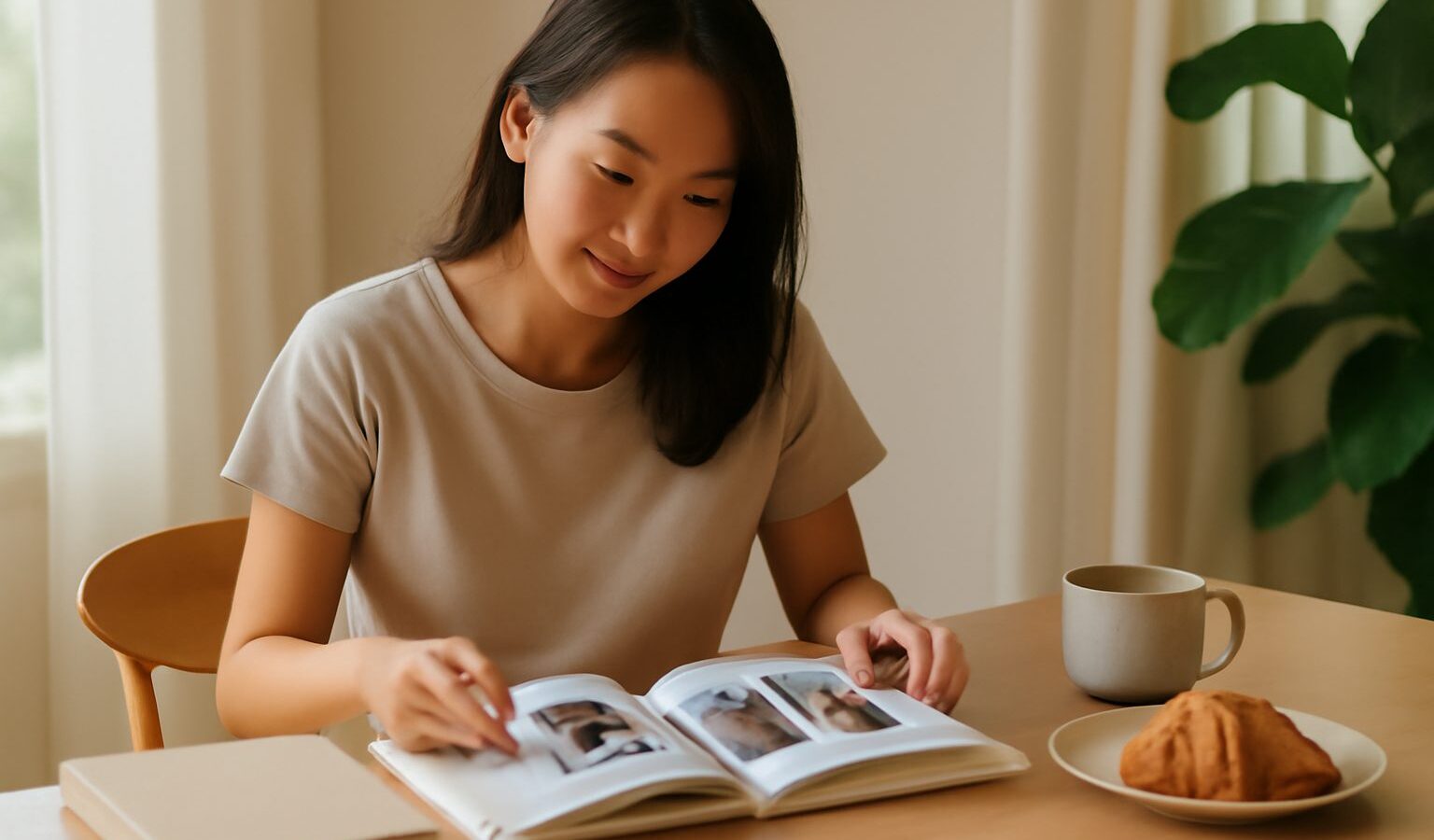
Knowing how to make a photo book turns a folder of forgotten files into something you can hold, share and keep for years. A good book is not just your best shots dumped onto pages; it is a curated story with a rhythm, thoughtful layout and considered printing. This guide takes you from a messy library to a finished book you are proud to put on the shelf.
Why print a book at all
Screens are endless and fleeting. A printed book is finite and physical, which forces you to choose and gives the images weight. For a wedding, a trip through the region, a newborn’s first year or a personal project, a book is a far better home than photos buried in a phone. It is also a lovely gift and, for working photographers, a persuasive portfolio piece a client can leaf through.
Step by step: from files to finished book
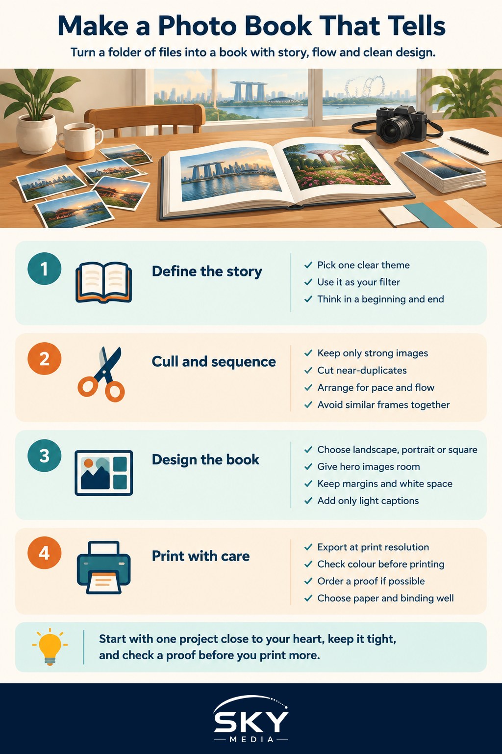
- Define the story. Decide what the book is about in one sentence, for example “our week in the Malaysian highlands” or “the shophouses of Joo Chiat”. A clear theme is your filter for every later decision.
- Cull hard. Gather all candidates, then be ruthless. A tight book of forty strong images beats a bloated one of a hundred and twenty. Cut near-duplicates and anything that does not serve the story.
- Sequence for flow. Arrange images like chapters. Open with a strong establishing shot, vary the pace between wide scenes and intimate details, and end on a note that feels like a closing. Avoid placing two similar frames side by side unless you mean to.
- Choose a size and orientation. Landscape suits sweeping scenery, portrait suits people and streets, square is flexible and modern. Pick what fits the majority of your images.
- Design the layout. Decide how many photos per spread. Give your strongest images a full page or even a full spread to breathe. Keep margins consistent and let white space do some work.
- Add restrained text. A short caption, a date, or a few lines of introduction can anchor the story. Keep type simple and let the photos lead.
- Prepare files correctly. Export at print resolution, not web size, and check colour so what you see roughly matches what prints. Soft-proof if your tools allow.
- Order a proof if you can, review it in daylight, then commit to the full print.
Layout principles that make a book feel professional
- Give hero images room. Crowding weakens your best work. One powerful photo alone on a spread carries more impact than four fighting for space.
- Keep a consistent grid. Repeating margins and alignment across spreads creates calm and cohesion.
- Mind the gutter. Do not place a face or crucial detail in the centre fold where the binding swallows it.
- Vary the pace. Alternate between full-bleed images and smaller framed ones so the reader’s eye keeps moving.
- Pair with intent. When two photos share a spread, let them speak to each other through colour, shape or subject rather than sitting there by accident.
- Use the opening and closing well. The first and last spreads are the ones people remember, so save two of your strongest, most representative frames for them.
Paper and finish choices
The paper changes how your images feel in the hand as much as any edit.
| Choice | Character | Suits |
|---|---|---|
| Matte paper | Soft, no glare, understated | Documentary, muted tones, text-heavy pages |
| Glossy paper | Punchy contrast, vivid colour | Landscapes, bold, saturated work |
| Lay-flat binding | Spreads open without a broken gutter | Panoramas and full-spread images |
| Standard binding | More affordable, widely available | Everyday books and gifts |
| Hardcover | Durable, gift-worthy | Keepsakes and portfolios |
Choosing a print service
Print options in Singapore range from online photo book platforms to local print shops that handle bespoke work. Rather than chasing the cheapest, weigh a few things: the paper and binding on offer, whether you can order a single proof, colour accuracy, and reviews of real finished books. A slightly dearer service that nails colour and binding is worth it for something meant to last. Ask whether they provide a colour profile so your exports match their press, and always inspect a physical proof before printing multiples.
Common mistakes to avoid
- Including too much. The most common error is refusing to cut. Every weak image drags down the strong ones around it.
- Ignoring resolution. Web-sized files look sharp on screen and mushy in print. Always export at full quality.
- Poor sequencing. A random order feels like a slideshow, not a book. Sequence deliberately.
- Overcrowded spreads. Six photos per page shouts album, not book. Less is more.
- Skipping the proof. Colours and brightness can shift in print. A proof saves you from a costly surprise across a whole run.
- Fussy fonts and clutter. Heavy captions and decorative type compete with your images. Keep design quiet.
Tips for a memorable result
- Edit for print, not screen. Prints often look a touch darker, so avoid overly moody shadows that will block up on paper.
- Keep a consistent edit across the book so it reads as one body of work rather than a mix of styles.
- Sleep on the sequence. Return with fresh eyes and you will spot pacing problems you missed.
- Start small. A short, well-made book teaches you the process before you attempt a hundred-page epic.
Bringing it together
Making a photo book rewards patience: define the story, cull hard, sequence with care, design clean spreads, choose paper that suits your images, and always check a proof. Do that and you will hold something far more meaningful than a folder of files. Start with one project close to your heart, keep it tight, and enjoy the rare pleasure of your photographs living in the real world.
Explore more: Printing and Displaying Your Photos · How to Cull and Organise Your Photos · Exporting Photos for Web and Print
Frequently Asked Questions
How many photos should a first photo book have? Fewer than most people expect. The article recommends a tight selection over a bloated one, and a short, well-made book is a good way to learn the process. Let the story decide the count, and cut anything that does not serve it.
What is the best way to back up photos before printing a book? Keep your edited, print-resolution files in at least two places, such as an external drive plus cloud storage. Save the layered or project file too, so you can reorder pages or reprint later without starting again.
Can I make a photo book as a gift for grandparents or a baby’s first year? Yes, these are popular themes. Choose larger text for older readers, use clear captions with dates and names, and pick a durable cover such as hardcover. Select a handful of milestone shots rather than every snapshot.
Should I print a photo book from a phone or from a computer? Either can work, but a computer gives finer control over layout, spacing and colour. Phone apps are quick for casual books. For anything meant to last, build the layout on a larger screen and check the proof carefully.
Is a photo book better than framing prints? They suit different jobs. A book tells a sequence and is easy to store and share, while framed prints showcase single images on a wall. Many people do both, framing a few favourites and keeping the full story in a book.