

Whether it is a work pitch, a school project or a wedding toast slideshow, knowing the basics of making a slide presentation in Singapore is a genuinely useful everyday skill. The good news is that the tools are friendlier than they used to be, and you do not need to be a designer to produce something clean and clear. This guide walks you through choosing a tool, building your slides, and presenting without the usual stress.
Pick the Right Tool for the Job
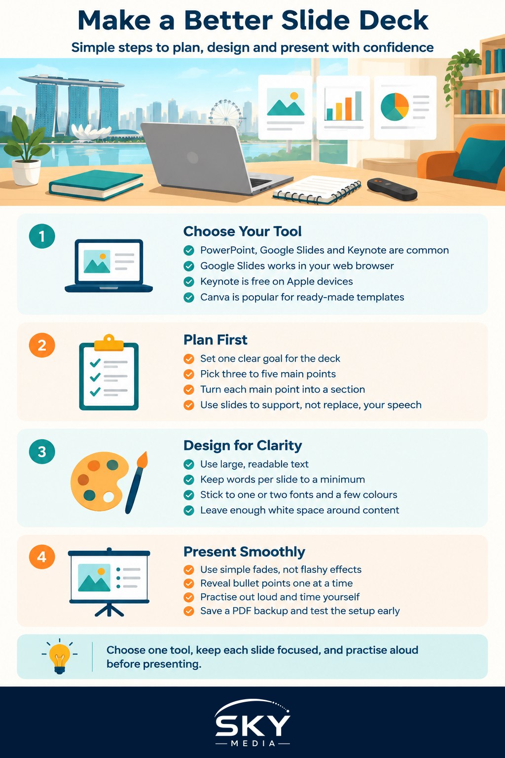
Most people already have access to a slide tool without paying anything extra. The three you will hear about most are Microsoft PowerPoint, Google Slides and Apple Keynote. PowerPoint is the long-standing standard in many offices and comes with a Microsoft 365 subscription, while Google Slides is free with a Google account and runs entirely in your web browser, which makes it easy to work from any computer or phone. Keynote comes free on Apple devices and is popular with Mac and iPad users for its polished look.
For quick, good-looking designs, tools like Canva have become very popular because they lean on ready-made templates. If you want a deeper walkthrough of that route, see our guide on getting started with Canva.
A few things to think about when choosing:
- Where will you present? If it is on someone else’s laptop or a meeting room screen, a web-based tool like Google Slides avoids file-compatibility headaches.
- Do you collaborate? Google Slides and the online version of PowerPoint let several people edit the same deck at once.
- Do you need offline access? A desktop app is safer if the venue Wi-Fi is unreliable.
If you are new to Google’s tools in general, our overview of getting started with Google Docs and Sheets covers the same account and sharing basics that apply to Slides.
Plan Before You Design
The biggest mistake people make is opening a blank deck and typing straight away. Spend ten minutes planning first. Decide on one clear goal for the presentation, then jot down the three to five main points you want your audience to remember. Each main point usually becomes a section, and each section becomes a few slides.
A simple, reliable structure looks like this:
- A title slide with your topic and name.
- An opening slide that says why this matters.
- Your main points, one idea per slide.
- A summary slide that repeats the key takeaways.
- A closing slide for questions or contact details.
Keep the golden rule in mind: slides support you, they are not your script. If everything you plan to say is already on the screen, your audience will read ahead and stop listening.
Design Clean, Readable Slides
You do not need fancy graphics. You need slides that are easy to read from the back of the room. A few habits make a big difference:
- Use large text. Aim for headings that are comfortably readable and body text that is not cramped. If in doubt, make it bigger.
- Limit words per slide. A handful of short bullet points beats a wall of text. Talk to the detail rather than writing it all out.
- Stick to one or two fonts and a small set of colours so the deck feels consistent.
- Leave breathing space. White space around your content makes it look tidier and more professional.
- Use good images. Insert clear photos or simple icons, and make sure any picture you use is one you are allowed to use.
Most tools include ready-made themes and layouts. Picking one theme and using it throughout is the fastest way to look polished. If you are inserting charts, keep them simple with clear labels, and remove any data the audience does not need to see.
Add Movement Carefully
Transitions between slides and animations within a slide can help, but only in small doses. A gentle fade between slides looks smooth. Spinning text and bouncing bullet points look distracting and can make you seem less prepared. A good approach is to reveal bullet points one at a time so the audience focuses on the point you are currently discussing, and to skip decorative effects entirely.
Practise and Present With Confidence
Once your deck is built, run through it out loud at least once. Speaking the words is very different from reading them in your head, and you will quickly spot slides that are too crowded or points that do not flow. Time yourself so you know you fit the slot.
On presentation day, a few practical tips help:
- Use presenter view if your tool offers it. This shows your notes and the next slide on your screen while the audience sees only the slides.
- Have a backup. Save a copy as a PDF and email it to yourself or keep it on a USB drive, in case the app or internet fails.
- Test the setup early. Arrive ahead of time to check the cable, adapter and screen resolution.
- If you are making short clips or visuals to include, our guide on making simple videos for social media has handy tips you can reuse.
A Quick Recap
Making a slide presentation in Singapore comes down to a simple flow: choose a tool you can access easily, plan your message before you design, keep each slide clean and readable, use movement sparingly, and practise out loud. Do those five things and you will produce a deck that looks professional and, more importantly, gets your point across. Start with a template if you feel stuck, focus on one idea per slide, and remember that a calm, clear speaker with simple slides always beats a nervous one hiding behind a busy screen.
Further reading: Using AI to Make Presentations and Slides