
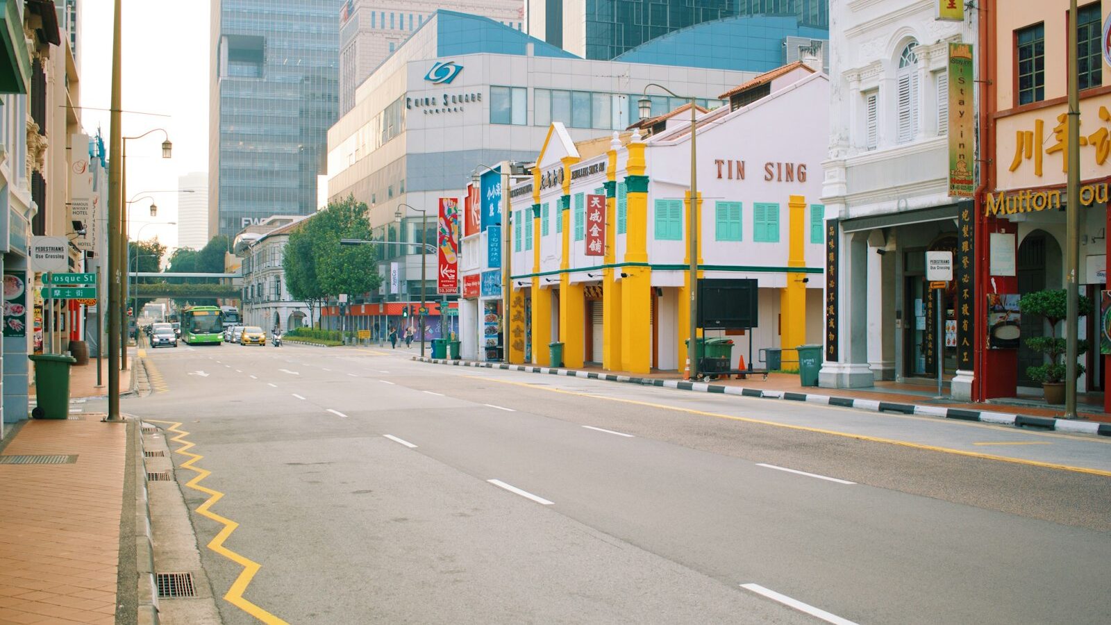
Have you ever noticed how a film can feel warm and nostalgic in one scene and cold and tense in the next, even when nothing in the story has changed? A big part of that feeling comes from colour grading, the craft of shaping the colours and tones of an image to set a mood. It is one of the most satisfying skills in photo and video editing, and while professionals treat it as an art form, the core ideas are simple enough for any beginner to start using today.
This guide explains what colour grading actually is, how it differs from ordinary editing, and the tools you will meet when you open your first grading panel. It is written for beginners in Singapore working with a phone, a camera, or free editing software, so the ideas apply whatever gear you own.
Colour Correction Versus Colour Grading
The first thing to understand is that there are two separate jobs, and they happen in order. Getting them mixed up is the most common source of confusion for beginners.
Colour correction comes first. This is the technical, tidying-up stage where you make the footage or photo look natural and accurate. You fix the white balance so whites look white rather than orange or blue, balance the exposure, and match different clips so they look like they belong together. Correction has a right answer: the aim is a clean, neutral, believable image.
Colour grading comes second. This is the creative stage where you push the colours and tones towards a particular look or feeling. There is no single right answer here; you might make a beach video warm and golden, or a rainy CBD street cool and moody. Grading is where your personal style lives.
Think of correction as cleaning and ironing your clothes, and grading as choosing an outfit for the occasion. You would not style an outfit over a stain, and you should not grade over an image that has not been corrected first.
Why Colour Shapes How We Feel
Colour carries emotion, and grading works because our brains link certain tones to certain moods almost automatically. Warm tones, the oranges and golden yellows of our late-afternoon light, tend to feel inviting, comforting, and nostalgic. Cool tones, the blues and teals of a rainy evening or an air-conditioned office, tend to feel calm, distant, or tense.
Contrast and saturation play their part too. A high-contrast, punchy grade feels bold and energetic, which suits a fast Reel of hawker-centre life. A softer, lower-contrast look with muted colours feels gentle and reflective, which might suit a quiet portrait or a wedding film. None of these are rules, but they are reliable starting points, and knowing them lets you choose a look on purpose rather than by accident.
A word of care with skin tones. Whatever mood you are chasing, people usually need to look healthy and natural, so watch faces closely as you grade. A cool grade that turns skin grey, or a warm one that turns it orange, will pull the eye for the wrong reason.
The Tools You Will Meet
Open the colour panel in almost any editor and you will find a familiar set of controls. You do not need all of them to make a good grade, but it helps to know what each one does.
- White balance and temperature: the correction stage foundation, shifting the image warmer or cooler and removing colour casts.
- Tone controls: exposure, contrast, highlights, shadows, whites, and blacks, which set how light or dark different parts of the image are before you touch colour.
- Colour wheels: usually three, letting you push colour into the shadows, midtones, and highlights separately. This is the heart of grading, where you might warm the highlights and cool the shadows for a cinematic feel.
- HSL controls: hue, saturation, and luminance sliders for individual colours, so you can, for example, tone down a loud red shirt without touching the rest of the frame.
- Curves: a more advanced tool for precise control over tones and colours, worth exploring once the basics feel comfortable.
- LUTs: short for lookup tables, these are preset grades you can apply in one click as a starting point, then adjust to taste.
LUTs deserve a note, because beginners often lean on them too hard. A LUT is a ready-made look, a bit like a filter, and it is a fine way to learn or to save time. But a LUT was built for someone else’s footage, so it almost always needs adjusting to suit your own white balance and exposure. Treat it as a first draft, not a finished grade.
A Simple First Grade You Can Try
You do not need expensive software to begin. Many free and widely known photo and video editors include colour wheels or a grading panel, and the workflow below applies to almost all of them. Work on a copy so your original stays safe.
- Correct before you grade. Set the white balance so whites are neutral, then balance exposure and contrast. Get this right and the grade will fall into place far more easily.
- Choose a mood. Decide in one word what you want the shot to feel like, such as warm, calm, or moody. This keeps your choices consistent.
- Work the colour wheels gently. For a common cinematic look, nudge a little warmth into the highlights and a hint of blue or teal into the shadows. Small moves go a long way.
- Refine with HSL if needed. Tame any single colour that shouts too loudly, and double-check that skin tones still look natural.
- Compare and pull back. Toggle the before-and-after view. If the grade looks obvious or the skin looks off, ease everything back until it feels believable.
The habit that matters most, exactly as with basic editing, is restraint. A subtle grade that supports the story beats a heavy one that distracts from it every time.
Correction and Grading at a Glance
Keeping the two stages clear in your mind is half the battle. This quick comparison sums up the difference.
| Aspect | Colour correction | Colour grading |
|---|---|---|
| Goal | A natural, accurate image | A mood or creative look |
| When it happens | First | Second |
| Is there a right answer? | Yes, aim for neutral | No, it is a style choice |
| Main tools | White balance, exposure, contrast | Colour wheels, HSL, LUTs |
| Example | Making white rice look white | Giving a street scene a cool, moody feel |
Colour grading rewards patience and a good eye more than any single piece of software. Start by correcting well, choose your mood deliberately, keep your adjustments gentle, and study the looks in films and photos you admire. Over time you will develop a signature style that makes your work recognisably yours.
Explore more
Colour grading builds on the fundamentals, so if you are still finding your feet, start with our guide to photo editing basics for beginners. When your library grows, learn how to cull and organise your photos, and see our guide to building a photography portfolio to show your best graded work.