
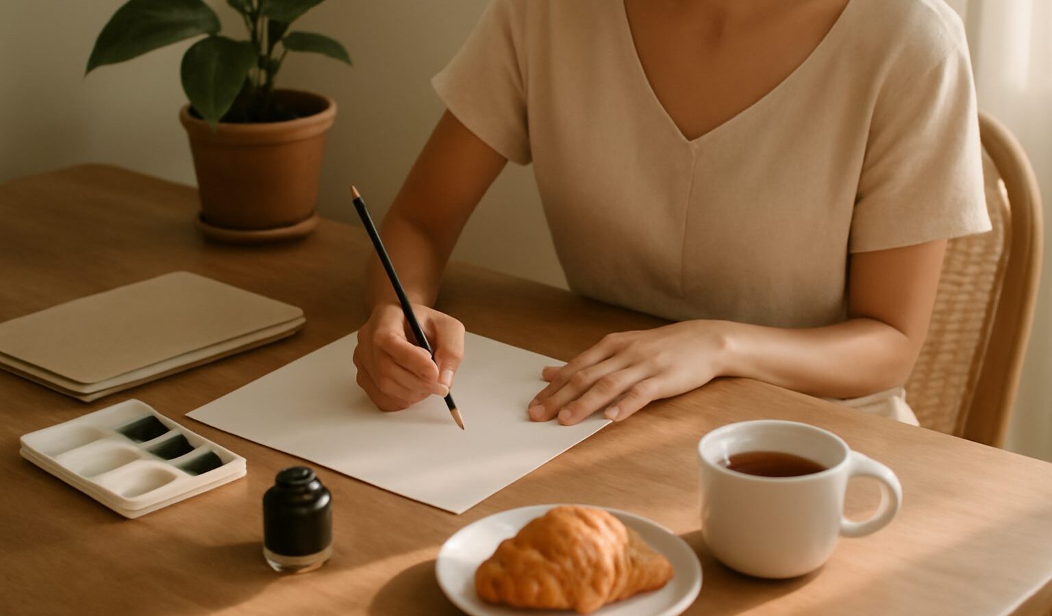
There is something deeply calming about calligraphy and lettering. In a world of typed messages and autocorrect, slowing down to shape each letter by hand feels like a small act of care, for the words and for yourself. You do not need elegant handwriting to begin, nor any natural gift for art. Beautiful lettering is built from a handful of simple strokes, repeated patiently, and anyone willing to practise can learn it. Singapore, with its many community classes, stationery shops and creative meet-ups, is a lovely place to pick it up.
This guide explains the difference between the two crafts, what starter tools genuinely help, the first strokes to practise, common mistakes to sidestep, and how to find friendly guidance nearby.
Calligraphy Versus Hand Lettering
People often use the two terms interchangeably, but they describe different things, and knowing which you prefer will save you money and confusion. Calligraphy is the art of writing letters, where each character is formed in continuous strokes, usually with a pen or brush that responds to pressure. It is closer to expressive handwriting, and the rhythm of it is part of the pleasure.
Hand lettering, by contrast, is the art of drawing letters. Rather than writing a word in one flowing pass, you construct each letterform, sketching it lightly, then refining, thickening and decorating it like a tiny illustration. This is why hand lettering sits comfortably beside graphic design, while calligraphy leans towards writing.
| Aspect | Calligraphy | Hand Lettering |
|---|---|---|
| Core action | Writing letters in strokes | Drawing and building letters |
| Typical pace | Flowing and continuous | Slower, sketch then refine |
| Common tools | Pointed pen, brush pen, nib | Pencil, fineliner, then ink |
| Feels closest to | Expressive handwriting | Illustration and design |
Neither is harder than the other, and many people happily do both. If you love the meditative flow of writing, lean towards calligraphy. If you enjoy planning, sketching and tidying up a design, hand lettering may suit you better. You can always cross over once you have found your feet.
Choosing Beginner-Friendly Tools
It is easy to overspend before you have written a single word, tempted by beautiful pens and pots of ink. Resist that. A modest, well-chosen kit is all you need, and starting simple keeps the craft affordable.
For modern calligraphy, a brush pen is the gentlest entry point. Its flexible tip gives you thick downstrokes and thin upstrokes with a change of pressure, which is the heart of the style, without the fuss of dip ink. A small and a large brush pen between them cover most early practice. For hand lettering, you need even less: a pencil, an eraser and a fineliner or two are enough to begin drawing letterforms.
A few unglamorous items matter more than beginners expect:
- Smooth, decent-weight paper, so your pen tips do not fray on rough fibres. Practice pads made for markers work well.
- A pencil and eraser for guidelines, because straight, evenly spaced letters start with lightly ruled lines.
- Guideline sheets you can slip under thin paper, giving you consistent height and slant without ruling every page.
- Patience with cheap tools at first. You can graduate to a pointed pen and bottled ink later, once the basic strokes feel familiar.
Local stationery shops and art suppliers carry starter brush pens and pads, and staff are usually happy to point beginners to sensible, inexpensive options. Buy a little, use it fully, and add tools only as your interest grows.
Your First Strokes and Words
The secret that surprises every beginner is that letters are built from a small set of basic strokes. Master those, and words assemble themselves. Before writing any letter at all, spend time on the fundamentals.
- Warm up with the entry stroke, a thin upward line drawn with light pressure.
- Practise the downstroke, pressing firmly as you pull the pen down for a bold, thick line.
- Combine the two into simple shapes, the underturn and overturn, which appear again and again in real letters.
- Fill whole pages with these drills. Repetition, not talent, is what trains your hand.
- Only then move to lowercase letters, then to short words, keeping your letters evenly spaced and consistent in slant.
The golden rule of modern calligraphy is thin going up, thick coming down. Keep that in mind and your lettering will look convincing far sooner than you expect. Work slowly. Speed is the enemy of control in the early days, and a steady, deliberate pace produces cleaner lines every time. Try to practise a little most days rather than in rare long bursts, since the muscle memory builds through frequency.
Sidestepping Common Beginner Mistakes
A handful of small habits trip up almost everyone at the start. Knowing them in advance saves a lot of frustration.
- Gripping the pen too tightly. A relaxed hold gives smoother, more even strokes; tension shows up as shaky lines.
- Going too fast. Rushing turns confident curves into wobbles. Slow right down until the shapes settle.
- Skipping the drills and jumping to full words or fancy flourishes before the basic strokes are steady.
- Comparing your first month with someone else’s third year. Progress in lettering is quiet and cumulative, not instant.
- Buying too much too soon. A drawer of unused pens will not improve your letters; daily practice with two will.
Keep your practice sheets in a folder and date them. Flicking back over old pages is the clearest proof of progress, and on discouraging days it reminds you how much your hand has already learned.
Learning and Practising in Singapore
You can absolutely teach yourself lettering at home, but a little guidance speeds things up and makes it more sociable. Singapore has a lively creative scene, with beginner calligraphy and lettering classes run at community clubs, arts schools and neighbourhood studios, alongside informal workshops and casual meet-ups where enthusiasts practise together over coffee. Public institutions such as the National Library often hold books on lettering and hand craft that you can borrow for free, a gentle and low-cost way to keep learning between sessions.
If you prefer company, a short beginner workshop is a friendly way to learn how to hold the pen and read your first exemplar without feeling lost. Do check current fees, dates and what materials are provided directly with the organiser or venue, as these vary from term to term and change often. Whichever path you choose, remember that lettering is a craft of patience and small daily wins. Fill a page, breathe, and enjoy the quiet pleasure of watching your letters grow more assured, one stroke at a time.
Explore more
If shaping letters by hand appeals to you, our guide to learning to draw as an adult in Singapore builds the same steady, patient skills. For a screen-based creative outlet, try digital art and illustration for beginners, and to sharpen your eye for design and craft, explore how to appreciate visual art in Singapore.
Related across Sky Media: A Guide to Calligraphy and Hand-Lettering · Calligraphy and Lettering Workshops in Singapore